For this project, my challenge was to come up with a visual concept (using product chosen by the merchandising team) that said: kids, colorful and springtime–which would also appeal to parents.

For this project, my challenge was to come up with a visual concept (using product chosen by the merchandising team) that said: kids, colorful and springtime–which would also appeal to parents.
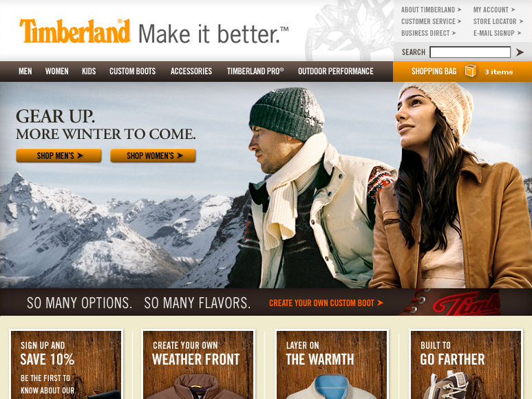
We needed a winter-themed home page image for a recent site refresh. However, none of the images on hand worked for the space/time-frame. So, I used two separate model shots and composited them onto the background, taking care to adjust color and lighting as well for a cohesive look.
The Seacoast Grower’s association desperately needed an upgrade to their existing website, but didn’t have a large budget. We worked out a fine solution in this simple, utilitarian site. This design was easy to update, and served them well for a number of years.

